Get weekly
HubSpot updates
As a marketer, one of the most infuriating things about using Facebook is the 20% ad copy rule. But that might all be about to change.
If you don’t know much about this rule, here’s a recap:
A few years ago, Facebook decided to introduce a rule regarding the amount of text that could be present in an image within a promoted post. This applies to a Facebook ad of any kind and also any post which was going to be boosted from the page’s feed. They introduced this rule to stop this type of thing:

And for this, we admire them. Nobody wants to see non-stop, uncreative ads in their news feed.
So Facebook launched a tool to help marketers figure out if an image was going to be rejected under the 20% rule. It consisted of a 5x5 square grid which, when overlaid on your image, would help you figure out if the image was over 20% text. However, the tool was flawed because any box which the text touched was considered filled, so unless you were willing to really squash your copy to beat the tool, you’re beautifully designed ads were doomed!

This 20% rule was particularly troublesome when boosting a post. If a post was doing really well and you decided you’d like to boost it, chances are you’ve not checked your design work. For Facebook, no boost means no money, so it’s not surprising they’re making changes here.
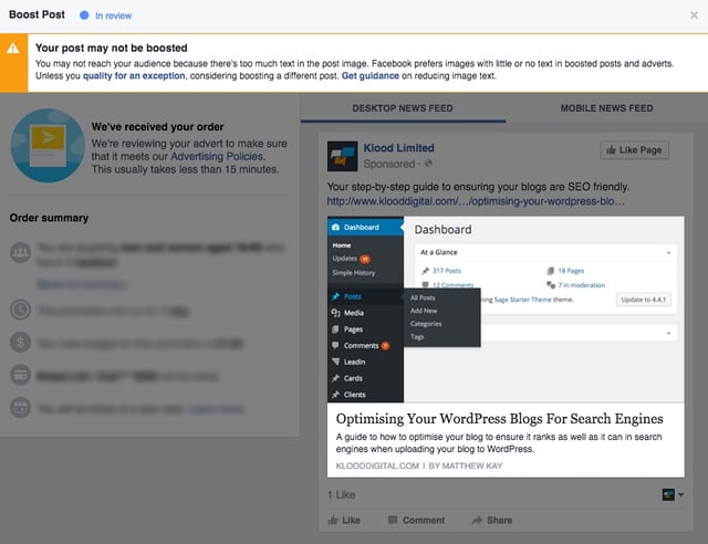
So what are the new rules? You may have recently tried to promote a post with some copy included in the image but, instead of the usual door being slammed in your humble marketing face, you may now be greeted with a warning message at the top or via a pop-up message.

This has had marketers puzzled for the last few weeks. what do they mean by you ‘may’ not reach your audience? Well the answers are finally here, kind of…
Click on this link to see all the advice from Facebook.
Facebook advises us to:
- Try keeping the amount of text to a minimum by reducing font size
- Make sure your copy is in the text box instead of the image
- Avoid spreading text all over the image
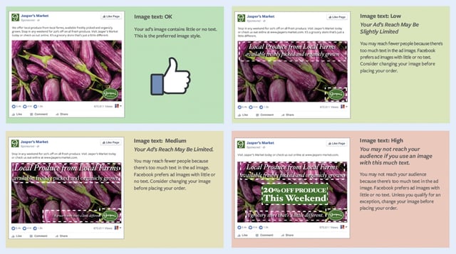
They then provide four example images that indicate that it’s now OK to exceed the 20% rule, however your ad may not do as well as a version with less copy.

They also mention that if you qualify for an exception you don’t need to worry about the text rules. Here’s what they’ve listed as exceptions:
- Movie posters
- Book covers
- Album covers
- Product images (`full product only, not cropped)
- Text-based businesses, ie: calligraphy, cartoon/comic strips
- App & game screenshots
- Legal text
- Infographics
So there are definitely a few ‘wins’ there for marketers! But hold your horses, because we’d recommend you tread lightly on this one. Just because the 20% text rule has been lifted, it hasn’t been thrown out completely. Play by Facebook’s rules and you’ll probably be fine.

