Get weekly
HubSpot updates
A website redesign can take anywhere from 45 to 90 days and longer depending on the complexity of the project and the needs the website needs to meet. Web design can sometimes seem like a dark art, and a whole re-design might feel like a daunting prospect. There’s also a lot of technical language to get your head around. HubSpot’s handy guide to Website Development has a great list of terminology to help get you started.
At SpotDev, we are on a mission to demystify every aspect of digital marketing, cutting through the jargon and taking you through every aspect of what we do, step by step. Here, we walk you through a typical website redesign project with SpotDev to give you an idea of what the process looks like.
Three Steps to Website Redesign
Clients tend to come to us for a website redesign for a range of reasons. The number one complaint is that the website is underperforming – they are not seeing enough traffic, and not capturing the leads they need. There is also often a design-motivation: their current site looks tired and outdated compared to competitor sites.
After an initial chat, we schedule a call to kick off the process and work through our three step process to get things moving.
Step 1: Strategy: 2-4 weeks
We start off with an hour-long in-depth call to outline your specifications to give us the beginnings of the raw material upon which to base your strategy. Based on this call, we set you homework, then follow up with a further call, or sometimes two further calls once we have your homework back. This process typically takes a couple of weeks. As our colleagues over at Blend B2B say, an in-depth research process is key to getting web design right first time. Questions we need to answer in order to devise a strategy and design that meets your needs include:
-
Who is your ideal customer persona?
-
Who is likely to be visiting your website? What kinds of new customers do you want to attract?
-
What is your main call to action?
-
Are your customers likely to be viewing your site in mobile or desktop format first?
From your answers to these questions we establish the screen-size that should be our primary design target and the details of what your website actually needs to do. These needs dictate the strategy and design.
Creating a style tile
After we have the answers to our broad strategy questions, we create a style tile with our design team. This involves the translation of any existing style guide you have to ensure it works for the web. Colours, fonts and other aspects of design may not work in the same way on a screen as they do in a brochure, say. Everything needs to be thought through. We won’t change the font or the logo, unless that is specifically requested by the client (and there is an extra cost associated with that). Instead, we keep the look broadly the same, but change the specific hashes of colours. If you don’t have any existing branding collateral of this type, we will create the style tile from scratch.
Step 2: Wireframing and Blue Sky Design: 1 - 4 weeks
Next, we move on to designing the site itself. At SpotDev, we allocate your style tile to a specific designer in our team, and put you in contact with them. They set to work, communicating with you as they work. They will work nonstop on your site until it is done.
We don’t use a website builder for our design and development, so we don’t work from templates. We start in a design programme - the web design equivalent of a blank canvas. At SpotDev we use one called Figma. We like Figma because it's a bit like Google docs in that you can see our mouse, the cursor moving around. So as a client, you can see our developer’s mouse moving around, you can see us changing things in real time. You can view it, as it happens, in your browser. This gives you that extra bit of confidence that there is design happening!
In Figma, all limitations disappear and you are not confined by prefabricated templates. Put simply, it can look like anything you want it to, although it’s important to be aware that the more pages and templates you need, the more involved and expensive the process becomes.
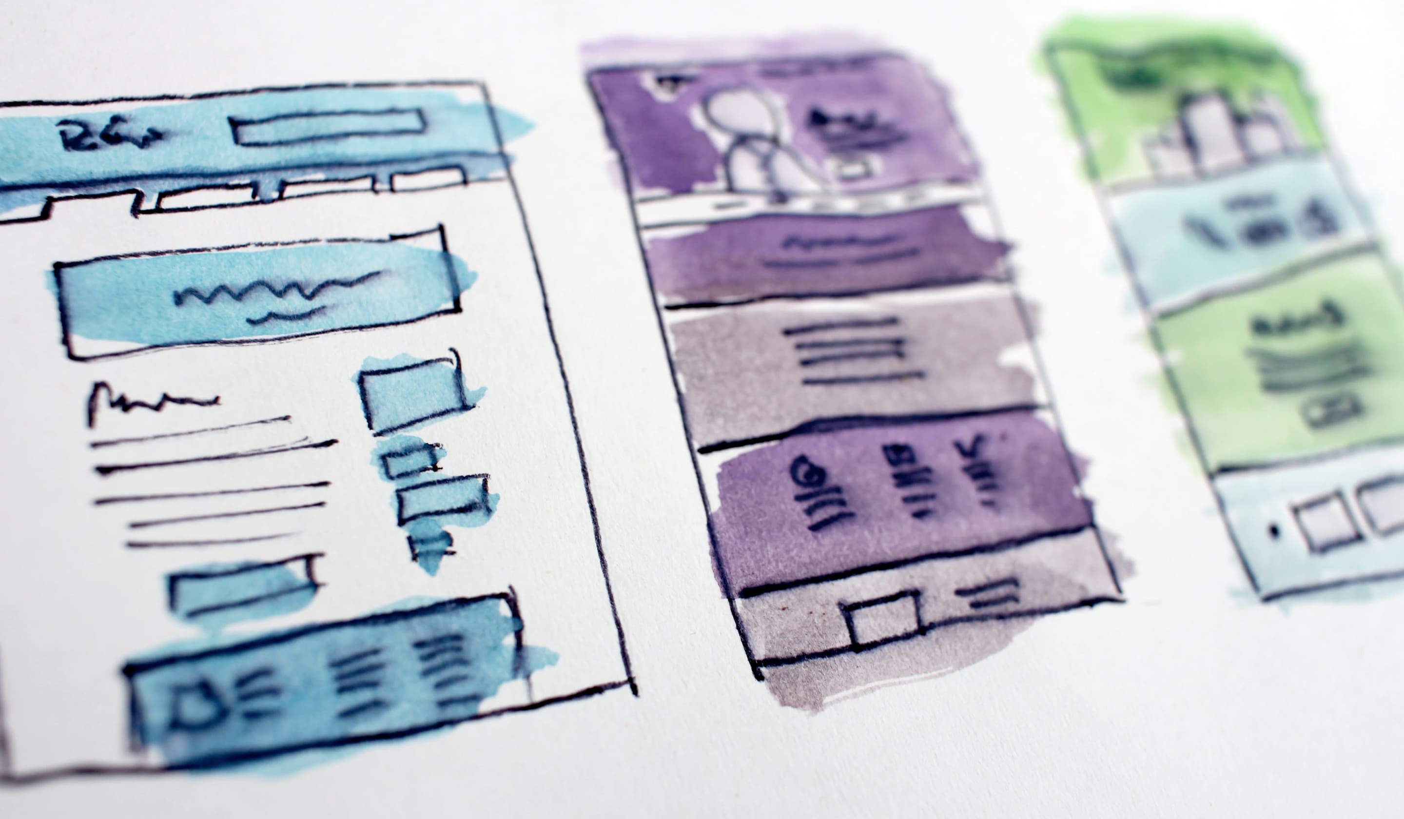
Alongside this design process, we'll prototype wireframes and share these with you. We design these so they reflect the intended user experience – taking you through the customer journey on your site as your customers will experience it. Once you are happy with the high fidelity mock-ups (we tend to go through a few iterations before getting to this point), we approve the design together and lock down any changes.
Step 3: Website development: 90 days
Development of most websites for the average medium-complexity sites should take around 90 days. It is possible to work more quickly than that, but at SpotDev, we believe it isn’t advisable, as the fine-tuning is essential to make sure you end up with a site you are happy with, and that does what you need it to do. If you find somebody who is prepared to turn a site around in record time, you should be suspicious.
Bringing your website to life
We check in with clients once a week on a scheduled video call. Because Figma is such a collaborative tool, we can make adjustments in real time, we can move things, establish how you want particular interactive parts of the site to behave. We can ask exactly how you want things to look, then bring that to life. There shouldn’t be any surprises when we show you what we’ve built.
Your site will be built using three different languages. Having a basic understanding of these is helpful as it helps explain the cost implications of different types of websites and features:
-
HTML: Controls the text and images that appear on the screen – the content.
-
CSS: controls the appearance of the text and images on the screen – what colour is it, how big is it, where is it on the page.
-
JavaScript: Is the interactive piece, if you click here, this happens. This controls much of the ‘magic’. It is the expensive bit.
Website copy creation
Some clients like us to write the copy for their site, bringing it up to date. Our team of writers can do this, but there is an additional cost attached. If you are interested in copywriting, schedule a call with us to discuss that. Otherwise, if you have some existing copy you are happy with, we will run that into the site once it has been built. If you decide to work with SpotDev for ongoing content creation, we will kick off a separate content process at the same time, creating content that will bring you increased inbound leads.
Interactive Extras
Some standard interactive aspects of web design are quick to build, a few interactive forms with lead-capture tools or a live chat function, for example. These kinds of interactive elements can be built quickly with minimal fuss – they are at the simple end of JavaScript development. But as soon as you start to add in something more complex and bespoke, such as a pricing calculator, or a quiz, it becomes more time consuming, and the cost increases incrementally.
Often, customers don’t realise that what they want requires a lot of JavaScript, because they don’t know how websites are built and they don’t understand why a particular interactive widget adds a considerable amount to their web-build. In terms of value, it can be hard to do a cost-benefit analysis. As a general guide, though, it never does any harm to have a pricing calculator on your website.
There are some great examples of interactive features on this blog by IMPACT. But not everybody has the kind of budget to allow for that. It may be more of a nice-to-have than a necessity. We can help you take a call on that, or you could consider launching your site then commissioning an add-on bit of extra coding (charged at an hourly rate) in six months’ time when you have the money to pay for a pricing calculator.
If you want to find out more about the cost of specific interactive features, or the cost of website redesign in general, read our companion post on the cost of website redesign here.

