In this post, we are going to create our own Facebook advert.
I will be using Photoshop CC, so if you’re using an older version of Photoshop you may find one or two minor inconsistencies, as well as a few functions that are not available. If any functions are CC or CS6 exclusive, I will be highlighting them as such.
Step 1
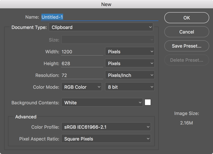
Open Photoshop and create a new document. I am using a 1200x628 pixel canvas (also known as the workspace), which is the more common size for Facebook ads. You can see a full list of advertising sizes on Facebook's help page.
Step 2
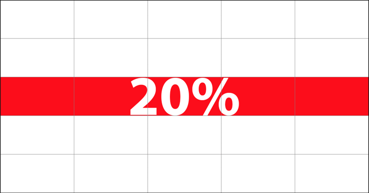
Facebook Ad images have rules about how much text your advert may contain, and may not contain more than 20% text. Now, it may seem a little confusing to work out how much text your image contains, but never fear, as there is an easy way to find out.
With your new document go to ‘Photoshop > Preferences > Guides, Grids and Slices’ and use the settings shown below.
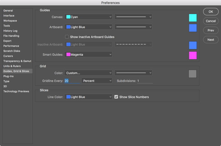
Once you have selected ‘OK’ go to ‘View > Show > Grid’ to make your newly made grid visible.
Now you have your grid, you can work out how much text you can use. In this instance, five boxes equal 20% of the workspace. As long as no more than five of the boxes contain text, your advert will adhere to Facebook’s guidelines. Note that one of the boxes will be considered to contain text if even a fraction of a single character crosses the line.
It is import to remember these rules as your adverts will be rejected if they do not meet the 20% guideline.
Step 3
Next, place your desired image onto your newly made workspace. You can simply drag and drop an image onto the workspace and resize the image to fill the space.
For this tutorial, I've found an image on Shutterstock. Remember to hold the ‘Shift’ key while dragging the corners of your image to maintain the correct proportions. Once you are happy with the placement of your image, press ‘Return’ to confirm.
Step 4
Now it’s time to add some text. Select the ‘Text Tool’ and click on your workspace where you would like to place the text. I want a nice big headline so, I'm using 67pt text and I'm going to make it bold. The body copy should be smaller so I'm going to create a new text line by clicking elsewhere on my workspace and changing the size of my text to 26pt.
Make sure to keep all of your text within the five boxes.
Step 5
We are nearly there, but I think we need to add a ‘Download Now’ button. Let's use the ‘Rounded Rectangle Tool’ to draw a rectangle and 3px dark red stroke around the edge.
Next, go back to the ‘Text Tool’ and type your desired call-to-action. I want this text to stand out, so I'm going to add an effect. Go to the effects options at the bottom of the ‘Layers’ panel.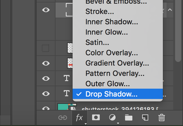
Select ‘Drop Shadow’ and change the settings to your liking. I only want this to be small so I've kept all of the settings low. Select ‘Ok when you are happy.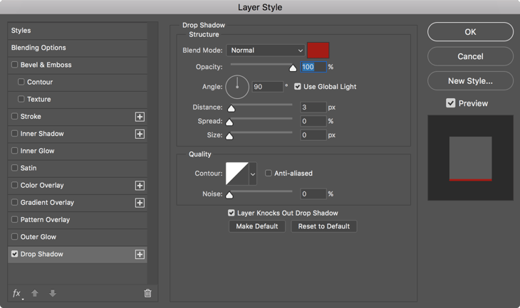
You can also add layer effects to shapes. I've added the same effect to an icon I've downloaded and placed on my workspace.
Step 6
Now I have my button I need to move it so that the text sits within my five boxes. Go to your layers panel and select the rectangle shape, text and icon by holding ‘Shift’. Now you have the layers selected you can ‘Move Tool’ and ‘Nudge’ them using the directional keys on your keyboard till they are in the right spot.
Step 7
Now we have our advert ready to save and upload to Facebook!
To save our newly created advert go to ‘File > Save As’, and then ‘Format’ to select the format you would like to save your advert as. I’d recommend saving it as a .psd as well as a .png so you can go back and make any changes in the future.
There you have it — you now have a Facebook ready advert!
New to Photoshop? Check out Part 1 of our beginner’s guide.
Stay Updated with Our Latest Insights
Get expert HubSpot tips and integration strategies delivered to your inbox.
