Get weekly
HubSpot updates
You've dazzled your website visitor with an excellent UX and educated them with your entertaining explainer video. Now it's time to tell them how much your SaaS product costs.
But how you communicate this can make or break your entire sales process. That's why it's essential to pay careful attention to every detail you include on your pricing pages.
Let's take a look at how you create a killer SaaS pricing page that generates leads.
Have a pricing strategy
By the time you get to pricing, you should have done plenty of market research to gauge how your target audience engages with your product. It's very likely, particularly for B2B, that you will have to cater to different customer categories.
SMBs might not be ready to use your full suite of features, while bigger organisations might require access to every available application. You don't want to lose out on either type of customer, so tailor your offering without isolating the start-ups or the high rollers.
To get a solid pricing model together, start by getting down to the core of what matters to your buyer personas. For example, Squarespace knows precisely the kind of customer that is attracted to its website-building CMS. There's even a dropdown menu of suggested customer profiles.
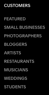
From then on, a visitor can get started with the industry-specific, customised templates so that they can get a taste, a glimpse, a vision of what their dream website could look like. When they finally get to the pricing page, full of ideas and inspired by what the future could bring, they are presented with a transparent pricing model that shows what is achievable relative to what they are prepared to pay.
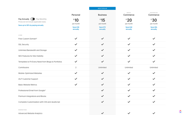
Squarespace knows that someone who wants a polished personal website, with all the important bits like a custom domain name and basic website metrics, shouldn't have to pay the same as a business that is looking to optimise for ecommerce and integrate with other platforms. That’s why they offer a tiered pricing system that includes the little guy, just as much as it caters to the big fish who like Squarespace's design model but want the freedom to customise it.
Price must correspond to the value offered
You may feel that your price is competitive and justified, and maybe it is, but if your pricing page doesn't demonstrate the value of your product, your customer will only see this number.
For your pricing page to generate leads, you have to help the customer weigh up why your value proposition suits your pricing model. It's crucial for every SaaS business to understand this concept because your intangible product is experiential, and if you cannot clearly convey the core benefits to the customer, they will struggle to connect the dots between price and value.
Let's take a look at Adobe Acrobat's pricing plan.
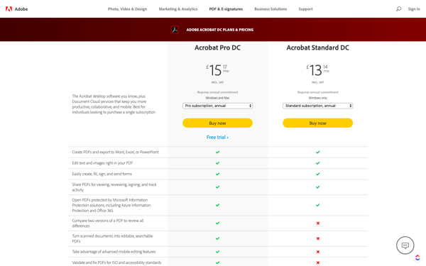
PDFs are now a commonly accepted medium for businesses to share documentation. A customer might simply need reassurance that Adobe enables the user to sign and edit PDFs. A more advanced user, however, might want to know whether PDFs can be edited on mobile devices.
Adobe has a very comprehensive list of features to satisfy a user at any level; there is even a more extensive dropdown menu that describes how users can interact with PDFs, create, edit, share and sign them.
And if that's not enough, Adobe's pricing page also takes users to a FAQ section. So if you started off with a limited idea of what was achievable with a PDF, you would certainly have a much broader view of how Adobe's product can help your business after reading their pricing page.
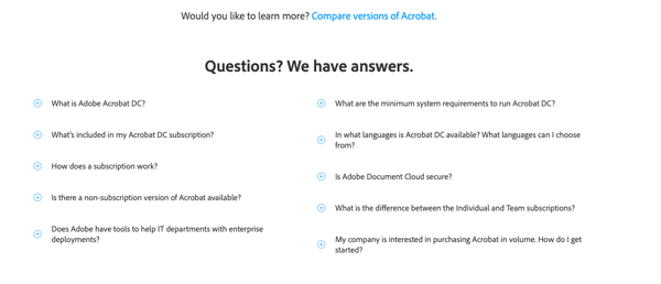
Adobe has done an excellent job of setting a fine balance between simple and complex content presentation. The pricing page starts off with the core basics and differentiating factors between their Pro and Standard versions, helping to drive someone who is already familiar with the product to make a quick purchasing decision. But if someone in your business needs a more exhaustive overview of the benefits – like the difference between individual and team subscriptions – the information is readily available.
The psychology of pricing
Managing your customer's pricing expectations can be tricky when it comes to SaaS. A visitor will often have a quick peek to check that your offering is within their budget. Price anchoring will help to make this initial glance less jarring. Spending money triggers an emotional response, so it's crucial to present your alternatives in a way that helps customers to quickly compare the options and identify where they fit into your pricing model.
An example of a slightly startling pricing page is Steinberg's WaveLab Pro 9.5 outlet.
If this was the first page you landed on before making your purchasing decision, you might feel a little overwhelmed by the price tag. Depending on what product version you select, the total adjusts, but that £480 figure is the first thing you see when you click ‘Buy Now’. If you haven't gone through the website, compared the products and decided what you want, you may click on the wrong product or find yourself flicking back and forth between tabs.
With something as technical as WaveLab Pro, a fair amount of knowledge is required to make the right decision, and it would appear that Steinberg assumes every purchaser will be an audio engineering expert by the time they get to this page. Not the best move when potentially selling to a novice podcast maker that requires a considerable amount of hand-holding to get to the right product.
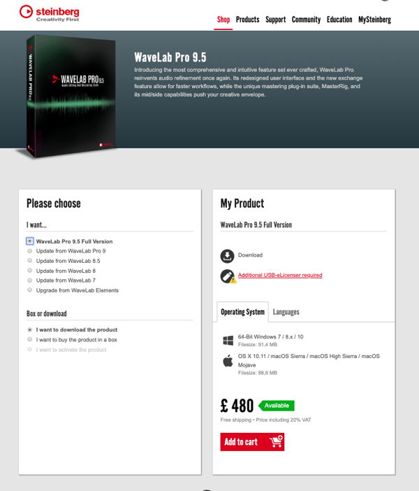
Although the website offers plenty of helpful resources, it would be useful to link back to those on the pricing page in case a lead is hovering over the ‘Buy Now’ button and feels unsure about whether to proceed or not.
Your pricing page needs to make the purchasing process simple. The customer shouldn’t have to backtrack through your website to double-check that they are getting exactly what they need.
Mental hacks that help you sell
- Make it visually compelling – Clean and simple is the best approach, but make use of attractive images and aesthetic colour combinations that make your CTAs pop.
- Use social proof – If it's relevant to your business, include things like your Trustpilot ratings or positive comments from existing customers. This provides assurance that you are a trusted vendor—and that your product delivers. It can often be the final push towards a sale.
- Offer a free trial – Software is all about the experience. What might be holding your customer back is not knowing how they would get on with your product. A free trial will get them past the first hurdle of becoming a customer.
- Point to a recommended plan – Make things even easier. Order your pricing options from highest to lowest and highlight the most popular. Studies show that this gets the best results. It helps customers to focus and make a decision.
In conclusion
SaaS pricing pages require continuous monitoring, A/B testing and improving so that you can prevent bottlenecks and help to keep your product competitive in an already saturated market. As your software upgrades, new questions and requirements will arise, so it's up to you to ensure that your pricing page always addresses those concerns and nudges the buyer towards the right decision. Your pricing page is a lead generating asset and, as such, should be treated as one.