Get weekly
HubSpot updates
The competition is fierce, and if your SaaS pricing page isn't generating enough leads, you may as well throw in the towel now.
Okay, maybe that's a bit extreme. But dedicating time to making sure that your pricing page is suped-up and ready to convert is one of the most worthwhile steps you can take to helping customers choose your SaaS product.
The starting point is, of course, a killer pricing strategy. When you've got this formula down, you can then start to focus on making a powerhouse pricing page to complement your efforts.
Say what? The importance of a compelling title
Clearly communicate your intention with the text you display on your pricing page. Your title is arguably the first thing to attract a prospect's interest; make sure that it aligns with your core messaging.
If you're offering a perk to the sign-up like a free trial, specify that in your heading. This will help to convince your lead that trying your service bears no risk for them.
The power of NOW: Be interactive and responsive
It wasn't that long ago when customers had to request callbacks or wait for email responses to get their questions answered. Thanks to AI, however, more and more businesses are leveraging the power of chatbots and automatic call-up of FAQ content created to address the most common queries you encounter from customers. Putting these features in place on your pricing page shortens the sales cycle significantly and helps the lead to self-educate.
Like it or not, instant gratification is a defining feature of the digital era, and buyers are increasingly accustomed to having on-demand access to information. HubSpot offers free chatbot builder software that you can check out here.
Demonstrate your value
Features mean nothing unless you can prove how they solve the customer's problem. Of course, the specifications of your product are important, especially if you need to show that your software is compatible with the client's current framework, but by the time they've reached the pricing page, your job is to emphasize the value of your solution.
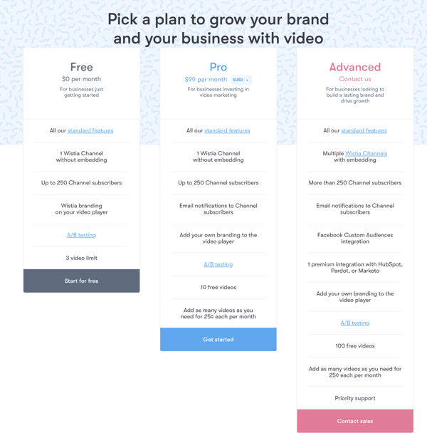
Wistia does this very well. The clickable “All our standard features“ CTA ensures that if the lead missed out on any of those details while scrolling through the website, they can take a quick dip back in to get all that technical information; but the rest of the pricing page is dedicated to showing the benefits – the stuff that gets results for the user. Oh, and they also have that effective title thing we mentioned at the start – no confusion, no gimmicks.
Show social proof
Since we’re already talking about Wistia, let’s take a look at what else they’re getting right. When you scroll a little further down on the pricing page, you’re presented with a slider that shows captions from industry leaders singing Wistia’s praises. This not only ups their street cred but adds reassurance that you’re in good company when you choose to purchase Wistia’s services. Including pictures and recognizable faces also adds validity.

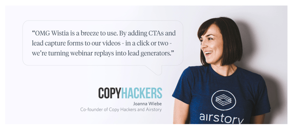
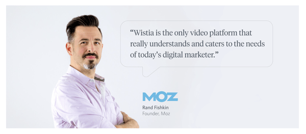
88% of consumers trust online reviews, so it makes sense to place a few positive statements around your pricing page to nudge customers towards a purchasing decision.
Point to the best option
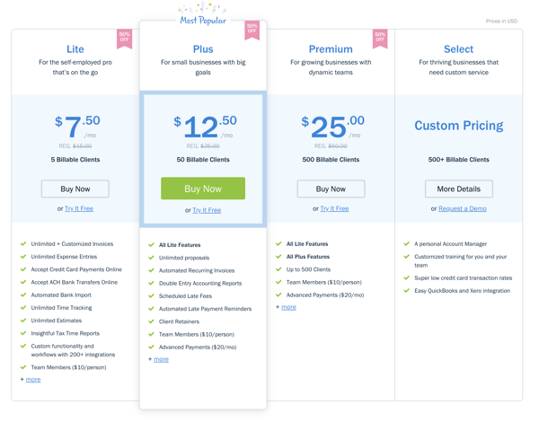
You’ve spent a lot of time researching your buyer personas, so you have a pretty good idea of which pricing plan is likely to be most appealing to them. Sure, the other options have their place and purpose, but why not narrow it down and simplify things for your target audience.
Freshbooks knows that small, ambitious businesses hit the sweet spot as far as target audience is concerned, so they’ve highlighted their most popular package – note how it’s also not their most expensive one.
A/B test your pricing pages
Once you’ve launched your pricing page, you don’t get to just put your feet up and wait for the leads to roll in. No matter how much thought and effort you’ve put into the layout, design and psychological triggers you’ve implemented, there is no guarantee that all those factors will have a positive outcome.
It’s best practice to create identical pages and tweak elements such as title and layout to see how your audience responds to each one. You should also use heatmaps to see if your CTAs are grabbing attention or acting as wallflowers.
Consistent testing will ensure that your page is always optimised and that your marketing game never stagnates.
Ring the alarm
Okay, you don’t want to induce anxiety, but a little sense of urgency never hurt anyone. If you’ve done everything else right and you’ve worked hard to build trust and confidence in your offering through the content you’ve made available on your website, maybe it’s time for that final nudge.
Perhaps send a pop up to offer a discount to a lingering browser who can’t seem to make a decision. Or use clever graphics to indicate that your current pricing is time-sensitive.
This can seem tricky when you have an intangible service, but you could, for example, have a limited offer for a select number of users who sign up within a specific time frame.
Your pricing page provides a multitude of opportunities to convert those already warmed up leads – don’t neglect it. Simplicity, clarity and evidence of results are the factors that make the buyer’s decision-making process easier. Your current pricing page will also hold loads of interesting information about what is currently working and what isn’t, so be sure to make this a starting point for reviewing your current strategy.
If you’d like one of our SaaS marketing experts to offer further insight into your pricing page, why not book an exploratory call with us? We can take a look at your website and have a no-obligation chat about what could be done to improve your overall digital marketing strategy and how to bring an inbound approach to your pricing pages.
