Get weekly
HubSpot updates
You may be asking: “What do you mean by an effective web page?”
Whilst the answer may be subjective and different for each marketer, in this post I define an effective web page to be one that engages with the user and prompts them to the next part of the customer journey.
We’ll take one of our web pages as an ideal example:
Use of Relevant Imagery and/or Video
They say that a picture is worth a thousand words. But, I’d like to go a step further and say videos are also worth a thousand words.As videos/images are a great way to allow the users to digest information without overwhelming them with text, we recommend using them, especially at the beginning of the page as this sets the scene and informs the reader what the page is about.
Having said this though, we would recommend using one or the other as it can be argued that having an image and a video one after the other can be a bit much.
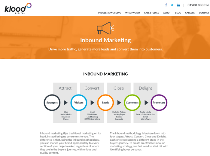
In the case of our webpage, we have used a diagram of Inbound marketing to inform the users what the content of the page is about.
Informative, Yet Succinct Content
While written content is an essential part of many web pages, it can be easy to fall into the trap of waffling. Even though there’s no hard and fast rules as to how many words your web page should contain, it’s safe to conclude that too much content can put users off. In other words, don’t say more than you need to.Offer Further Content
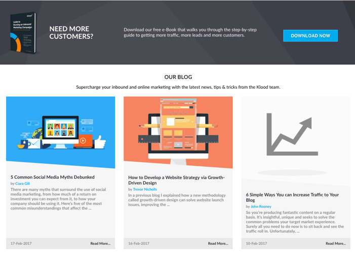
Off the back of the second point, while it’s recommended not to write too much, a way round this would be to offer downloadable content around the topic. So if the users would like to find out more, they can.In our example, notice how we’re offering an eBook on inbound marketing — but, we’re not giving it away for free. The users need to give us their email address. By pursuing this strategy, not only are we giving valuable content to the users, we’re also building our mailing list. It’s a win-win situation.
Introduce Blog Posts
Many times I’ve witnessed websites putting a lot of effort into their blog posts without really promote them effectively. They probably get the odd promotion on social media, but in many cases they just stop there, which is a shame really. Especially, if you’ve spent a lot of time, effort and resources in their creation. So in order to get the most out of them, we recommend highlighting them on your web page. This way, if someone wants to explore and read them, they can easily do so.Contact Form
Most businesses want to encourage customers to get in touch with them, and having a contact form on every web page makes it easy for people to do so. Many businesses have a dedicated ‘Contact Us’ page, and while there is nothing wrong with this, we believe it’s even better to have a short contact form on all other web pages too. By doing so, you’re closing the gap and effectively reducing the chances of users leaving your website without leaving their contact details. You’re making their journey just that much easier.Ask for Feedback
To further the users engagement, we recommend asking them for their feedback. In other words, their experience on the webpage. It can even be something as simple as this: 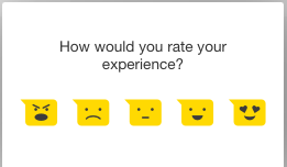
Analysing the emoticons, it is easy to conclude that from the left to right, the emoticons suggest a very bad to excellent experience.
Having something like this on individual web pages can really help you to identify which pages aren’t working so well for you. This in turn can help with continuous improvement on your website.
To find out more about generating leads and engaging users with your web pages, check out our ‘Guide to Running an Inbound Marketing Campaign’ below.
