Get weekly
HubSpot updates
Remember the 90’s when people would sign up for any old newsletter just so they would get an email?
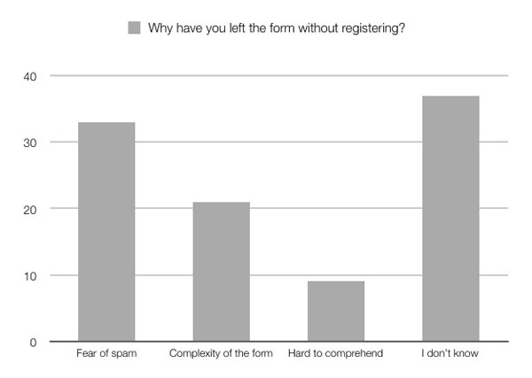
Things have changed, and with our inboxes now full of irrelevant junk and offers, it has never been more difficult to convince people you won’t spam them if they leave their details.
Industry standard for website/service sign ups is 2%. I hear people ask all the time if this is a good conversion rate. Well, yeah, in this industry, but this means that 98% of your visitors aren’t interested. That's not so great!
Here’s some great ways to improve the chances of getting those elusive signups and contact details.
Pop-ups
Timing is key. When are you asking for their details?
What is more annoying than trying to read a vital bit of information when a pop-up asking you to sign up covers the whole screen?
This is seriously ugly interrupt marketing in all its glory!
The results from pop-ups since they appeared nine years ago are interesting. Aweber did a study on one of its customers and found that pop ups drove an enormous 1,375% more signups than the sidebar form. You can see how this could have great potential.
But what the stats don’t show is how many of these signups are going to become active and engaged customers of your brand or service. Would you prefer someone who had actively hunted out your signup form with no coercion? Maybe these are more likely to become your customers.
Would you rather have a list of 1,000 actively engaged subscribers or 100,000 who never read, let alone click from your newsletters?
I would advise you put a form on every page. You can put this in a top bar, sidebar or even your footer just avoid the ugly pop up.
If you want to use a pop up, try to offer something of value and time it correctly.
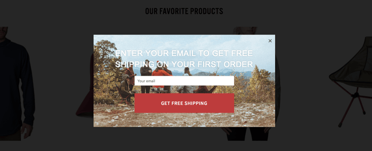
Check this great pop up from Mountain Standard, it works because it has all the elements of a good pop up with a friendly tone and with value it could also work very well as an exit pop up.

How long is your form?
Do you ask for someone’s life story, or just their name and email adress? Do not over complicate your forms with non essential information. Do you really need to know someone’s date of birth or phone number? Getting someone's email is already a highly prized win. You might want their phone number too, but don’t put people off at this early stage of your relationship.
Check out this study from Design Modo:
One company saw their form completion rate jump to 120% when they reduced the form fields from 11 down to four.
What fields do you really need?
Do you have a field that will cause your potential customer to think about the answer? maybe this will lead to them abandoning the form, or require them to get some more information.
Do you offer anything of value?
You want people to join your list so can keep contact and tell them about your wonderful products and/or services.
We all get more emails than we can be bothered to read, so make sure you are giving people something of value when asking for their email address.
We all like free stuff — maybe it’s a money-off voucher code, a free report or an instructional PDF. What will make your customers agree to give your their details? make it worth their while and make it awesome.
Test Everything
The truth is, you can look at the stats and studies to gain information, but every business, industry and audience will differ. The only way you are ever going to know for sure is by testing. Test everything and often: wording, colours, placements. Everything you can think of.
Remember, nobody should know more about you customer than you!
Request a free Inbound Marketing Assessment below and we'll identify reasons your website might be losing you leads.

