Get weekly
HubSpot updates
Understanding how psychology can play a role in your email marketing can help improve your brand’s email campaigns. Many of us, especially those who are office based, spend more time checking our inboxes than we would like to admit and this can have an effect on a person’s attitude towards your brand.
Checking your emails has been found to be addictive as many of us actually, even if only subconsciously, enjoy the act of receiving and opening them. By making sure your emails have the right content and are sent to the right people, subscribers are likely to associate your brand with these positive feelings.
Psychology of colour
Colour can play a big role in the way your reader absorbs the information in your newsletter, depending on the desired action or industry that you work in, you may want to test how the colour of your text, headings and call-to-action buttons affect your click through rate.
Although different cultures do associate colours with different meanings, some of the most common associations to colours are:
- Red: Energetic
- Orange: Aggressive
- Blue: Trustworthiness
- Green: Relaxing
- Yellow: Optimistic/youthful
- Pink: Romantic
- Black: Powerful
- Purple: Calming
Colour psychology is most commonly applied when it comes branding and so you may notice that your company’s logo has incorporated a colour that symbolises how the brand would like to be perceived, for example: many banks choose blue, luxury companies select black. With this in mind, the call-to-action buttons in your email marketing campaigns should be able to stand out but still compliment the overall look of your email, which is likely to be based on your brand’s colours. Take a look at Three Deep’s complementary colour chart to help find the right colour to test for your CTAs in your next email campaign.
Picking the right image
As much as we would all like to believe, we know that not all of our subscribers read every word of our emails, with the majority of our emails only ever being scanned. With this in mind, choosing the right image for your email can make a big difference to your click-through rate.
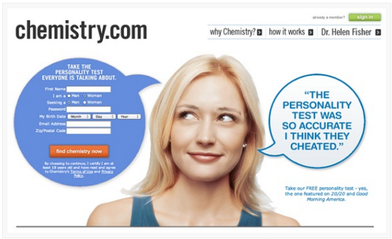
The fusiform face area of the brain is where we process faces and make emotional connections, including images in your email which features a person allows the user to experience an emotional response, which can be associated with your brand. The right image can also draw the eye to your CTA in a discrete manner, for example, by using an image of a person who is looking in the direction of the CTA, the user is more likely to pay attention to the desired action which can increase your email’s click-through rate.
Personalisation
Something as simple as including a person’s name in an email newsletter can really help to improve your click-through, and ultimately, your conversation rate. It has also been found that personalised subject lines can result in a 26% increase in your open rate. So before you send your next newsletter, why not try adding a personalisation field to include your subscriber’s first name and see how it can affect your open rate?
Like all things email, there is no exact science but by experimenting with a few of the ideas above, you will be able to see what works best for your business.


