Get weekly
HubSpot updates
Picture this: You’re a user on a website at the decision stage of the buying process, and you know exactly what product you want.
What do you do?
You head straight to the search bar and type in the exact product you want, such as ‘PrettyLittleThing body with button detail in white’.

Now imagine you’re a user who’s more towards the end of the consideration stage, and so you know the type of product you want but don’t quite know what that product is exactly.
What do you do?
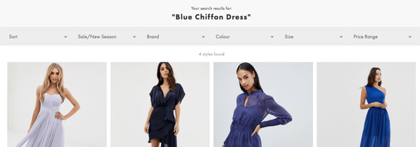
Instead of trolling around the navigation menu you go straight to the search bar and type in the specification you’re looking for, like ‘blue chiffon dress’.

See how easy either of those examples would be to get a result for if you were a user?
User experience (UX) is everything, and when it comes down to your website, the better you make it, the more your customers will love it and your brand. The search bar, as demonstrated, plays a big role in the UX, but here are some stats that show why it’s important for your business and customers:
- Up to 30% of visitors to a website will use the search box, and 43% will immediately use it.
- 72% of websites fail users’ search box expectations.
- 12% of unsuccessful searches end with the user going to a competitors website
- On-site searchers are 216% more likely to convert than regular users.
- Visitors who use the search function spend 2.6x more.
- 13.8% of a website’s overall revenue comes from visitors using search boxes.
- Customers are 6x more likely to convert if they use the search bar autocomplete functionality.
- Because test subjects perceived on-site search to be faster than category navigation, this was found to be the preferred product finding strategy.
Now we know why the search bar is important to your eCommerce website, let's take a look at some brands that are doing it right:
Amazon
As shown below, Amazon has their search bar at the top and centre stage, showing users this is the most efficient way to navigate around their products.

Ebay
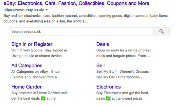
Ebay is another big eCommerce brand that have put their search bar as the focus in the header and have even added it to their Google search snippet, giving the users the option to skip a step and get straight to looking.


Want to know why these brands have hit the nail on the head when it comes to their search bars? We’re going to explain how you can optimise this feature, and the best practises you should use when creating one.
- Autofill
Offering product suggestions around the information a user is typing in helps to speed up the search, avoid misspellings, prompt help if a user is unsure, and return more relevant results.
- Language
By making sure your search bar understands misspellings, synonym variation, and plurals means that if someone types in ‘shoe’ it will still return a search for ‘shoes’. Also, making sure semantic searches are understood allows for dynamic filterings, such as ‘Red toaster’– that relies on two product features to be retrieved, ‘red’ and ‘toaster’.
- Mobile friendly
Making the search bar is visible and usable on mobile is often overlooked. Ensuring that you have a responsive search bar that is big enough to type in helps browsers to use this crucial function with greater efficiency.
- Design
The colour contrast, positioning, directions and size of the search bar will determine its visibility and usability for the users. Having a simple push-button that is clear and easy to press is one key feature to consider along with also including clear, actionable text that states what the search bar and button do, such as ‘search product’ and ‘search’. The bar should stand out, and designing it with colours that mean it won’t blend in with the other features around it on the website will make sure it is spotted by users quickly without making them hunt for it.
- No results page
Although you should try to minimise the number of searches that don’t fetch a result, the page that appears when there is nothing to be found should be optimised to show alternative options, product categories, ‘did you mean’ suggestion and ‘help/contact’ information to get some assistance with the product they are looking for.
- Tracking, heatmaps and search logs
Reviewing and analysing users’ search behaviour is important data to obtain. Using tools like heatmaps and search logs, you can discover how shoppers are typically using the search bar and gain perspective on any missed opportunities, as well as where the performance could be improved to help your users’ needs.
- Non-product
When statistics show 34% of users tried to search for non-product content on a website, this is an key feature to consider. We expect the search bar to work like Google and that it should troll the whole of the website rather than just products. It should give users the opportunity to find the information that is normally hidden and hard to find, such as returns, shipping, and order tracking information.
- Breadcrumbs
Leaving a product trail of what categories the searched product fits into, and where it would have come from in the navigation, allows the user to explore similar products to the one they are looking at through removing or filtering the categories further. For example, when searching for ‘denim dress’, the breadcrumbs allow me to go a step back and look at everything denim.

It's crucial to remember that the search bar is one part of your eCommerce website, and UX is determined by other features on your website too. Considering an all-encompassing approach to how your website is designed, from the search bar to the footer, will determine its success.
Find out how the 7 figure eCommerce growth plan can help your business.

