Get weekly
HubSpot updates
There is an emerging trend that is dividing the digital industry: one-page web design.
More and more organisations are opting for single-page websites, and there are a number of good reasons to go for it. So why the debate? We've taken the time to list out some of the benefits and negatives of a one-page website here.
The Benefits of a one-page website:
- Improve user engagement
- Ease of telling a story
- Strong design delivered quickly
- Ideal for mobiles
The Negatives of a one-page website:
- Your SEO
- Page Load Time
- Ability to share lots of information
- Shareability
- Hard to analyse
The Benefits
Improve user engagement
The attention span and patience of internet users have never been shorter.
We don’t want to have to trawl through complex websites to find the information or products we need. In fact, the average web user will stay on a web page for just 15 seconds, so the sooner you can get your message across the better.
By condensing all of the most important information onto one page you may be able to retain the interest of fickle visitors more easily than if your website was made up of multiple pages.
Of course, simply cramming everything onto one page won’t benefit user engagement if it’s not designed well. Check out these 21 examples of beautifully designed single-page websites.
READ MORE: 7 Formatting Tips for Boosting Blog Post Engagement
Easier to tell a story
With one-page web design — if you structure it well — you can control the order in which users consume the information better than on a multi-page site.
Users tend to jump from one web page to another, potentially missing out on content that is crucial in the conversion process. Utilising a single page, you can clearly direct website visitors along that conversion path.
A strong design delivered quickly
The design and development of a single-page website is inevitably much quicker and cheaper than for multiple-page sites, but it also gives the designers the chance to make sure that the design of that page is on-point.
They can really focus on delivering a consistent and immersive user experience, helping to boost engagement and hopefully conversion rates too.
Ideal for mobile devices

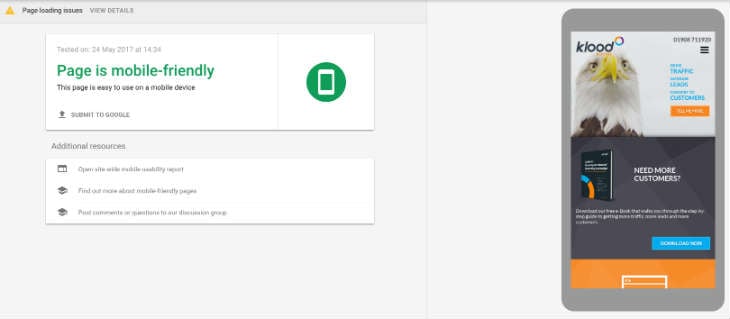
The push towards responsive design has eased the difficulties of navigating websites on a mobile device significantly, but it can still be less than ideal on a smartphone with a small screen.
By contrast, single-page websites are much easier to optimise for mobile. They are also much easier to navigate, with users only having to scroll to find the information they need — an action we’re very used to thanks to the likes of Facebook, Twitter and Instagram.
Find out more about the pros and cons of one page vs multi page website design.
The Negatives
SEO
Most organisations want to rank organically for a number of phrases. After all, most organisations do/sell more than just one thing, and often in more than just one location.However, a single-page website is difficult to optimise for more than two or three without your efforts appearing spammy. What’s more, you only have a single title tag, meta description and URL to make use of.
A single-page website won’t allow for you to incorporate a blog either.
Adding fresh content to your site regularly is thought to be key in ensuring strong organic rankings, while blogging is also one of the most effective methods of driving traffic to your website by giving you the chance to rank for more niche searches.
Page load time
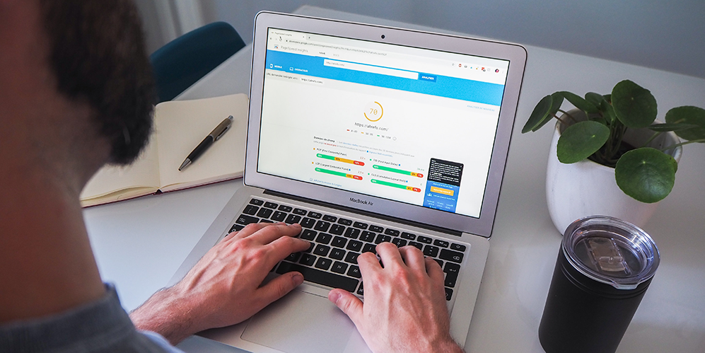
Google confirmed way back in 2010 that site speed was a ranking signal, and this is another speed bump for single-page websites.
If all of the information that would otherwise be spread across many pages is on just one — videos and graphics etc. — it could become pretty large. The more content and data a browser has to download from the server, the longer it takes load.
This not only negatively impacts on your SEO, but it also seriously damages user engagement.

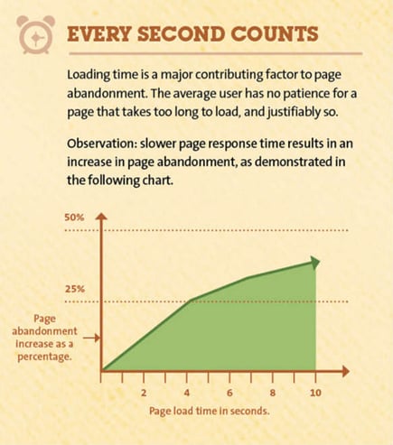
Source: Kissmetrics — How Loading Time Affects Your Bottom Line
The graphic above demonstrates how abandon rates increase as page load time goes up. Another key statistic is that a one second delay in page response can result in a 7% drop in conversion rates.
Not suitable if you have lots of info to share
The 21 organisations listed in the article linked to above have been able to get across a compelling sales message without a lot of text, however this isn’t always possible.
“If your company provides various different types of service or product, a single-page website is almost certainly not for you.”
Some companies need a lot of content to explain their offering (though every copywriter should be wary of overwriting, even for the most complex of products/services) and if this is the case for you then a single-page website might not be suitable.
You don’t want to overwhelm your audience with too much information all in one place as this is one surefire way to kill user engagement. If your company provides various different types of service or product, a single-page website is almost certainly not for you.
Not very shareable
With all of your content on one page it can be difficult, if not impossible, to allow website visitors to share specific elements of your content.
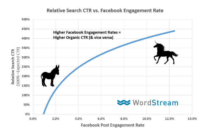
 Source: WordStream, via Moz: What's the Real Relationship Between Organic Rankings & Social Shares?
Although social shares is not considered to be a ranking factor, there is strong correlation between a website’s rankings and how often its content is shared. Considering single-page web design best practice is to keep things clear and concise it is unlikely you’d have much in the way of content to share anyway.
Hard to analyse what works
You can use Google Analytics to track goals that you set up on your website, while it can also show how users navigate your website, which pages they exit on and which are proving most popular.With a one-page website much of this insight isn’t available to you. If you’ve got a high bounce rate or low session duration, how do you know which element of your web page is causing the problem?
Tools such as Hotjar can track metrics like scroll depth to show how deep down the page visitors generally go, but you’ll be missing out on a lot of info about your site’s performance that GA can provide.
So which is right for you?
There are some pretty significant downsides to one-page websites that make it an unfeasible solution for the majority of organisations, but the positives shouldn’t be ignored for smaller enterprises.Is it the right option for you? The truth is it depends on what you offer and how much information you need to get across.
The type of industry you’re in will also have a big part to play. If you work in a creative space then a one-page site might be perfect for showcasing your work, while they can also work for promoting individual campaigns.
Audit your existing website
If you’re not sure if your existing website is performing to the best of its ability then why not download our SEO audit worksheet to find out the things you should be considering to make sure your website is performing at it's best.

