Get weekly
HubSpot updates
Furthermore, factors such as user experience (UX) and search are often not taken into consideration, particularly in website design for small-medium sized businesses.
It’s likely that one-page sites are design led rather than evidence led. ‘We think this will look fantastic’ versus ‘we've looked at your goals and website data and we know this is the right approach’.
The difference between these two points of view is huge and is why we are moving our web development processes towards growth-driven design, where website development is based on fact, not opinion.
If you want the TL;DR, just jump straight to the ‘ Should I choose a one page or multi-page website?’ section.
Before we jump into the pros and cons of each end-product, let’s start with why I’m writing about this topic.
Why all the fuss?
To those outside the marketing industry, my belief is that many people don’t take into consideration factors that could dictate whether choosing a one page website is appropriate or not.
I don’t think you can hold somebody accountable for something they weren’t aware of, but I’ve been involved in many conversations where, for example, a client has become frustrated because they weren’t told that a one page website might harm their performance in organic search results.
The purpose of this article is to try and inform any stakeholder involved in a website project whether a one page, or multi-page platform is the right way to go.
What is a one page website?
A one/single page website (sometimes referred to as pageless design) is where a website uses a single HTML page to render the content and functionality associated with it. When interacting with the web application, navigation links take the user directly to the relevant part of the content or feature. The website often uses coding languages like JavaScript, jQuery, CSS3, or Ajax to complete this process.
There are lots of examples of one page designs online, and one website is even dedicated to showing the best of these.
Advantages
One page websites come with a distinct plus point in that they are often able to display content in a simple, easy to digest format. One-page sites leave a certain amount of freedom for designer and developers to get creative with the way each section can interact and move around.
From a UX perspective, there can be significant advantages. Navigation is often simplified and enables visually appealing storytelling. A less complicated navigation often leads to less clicks. Tie this in with the fact that scrolling is a much more natural movement for users (particularly with the world’s familiarity with mobile devices) and you get a more compelling user journey. As a result, users will often be more engaged with the content, and there are studies to suggest long-form content pages out perform their short-form counterparts in terms of conversion rates.
One page websites also give website owners more control over the distribution of their information. On traditional websites, users can click back and forth between pages and this can lead to a disjointed user journey. One page sites allow an appropriate flow of content that is designed to be given to the user at the most appropriate moment.
All of this means that although one page sites can be a compelling option, they might not be appropriate for your business. This is where a multi-page website may come in.
What is a multi-page website?
Multi-page sites are close to being the exact opposite of their single page counterparts. Multi-page websites would host/display the same content, but would render it across multiple pages.
They’re an absolute must for organisations with a broad range of content, products or services because it would be nigh-on impossible to display thousands of articles or products on one page.
Multi-page websites are much more common than single page applications and are what most would consider the archetypal website development project.
Advantages
Multi-page sites are much better for more complex web projects which require more content, or enhanced functionality. Trying to cram too much content into a single page website is terrible for a user’s overall experience as they might find it difficult to locate and then interact with what they came to the site for.For large sites, such as an eCommerce site, this is most likely the route you would want to take. However you must ensure that you are appropriately thinking about your website’s architecture so that users can find content they’re looking for as fast as possible.
One must also consider any integration with online marketing efforts — particularly search.
When someone uses a search engine it attempts to serve them the most relevant results. Certainly this is true for organic search, and you could make the argument that this applies to paid search too. This means that for queries that are similar in nature, you should be creating separate pages for each topic or set of keyphrases. You can’t do that with a one page website because you’re unable to be specific enough — it’s a one-size-fits-all solution — so multi-page sites have a significant advantage over one pagers in this respect.
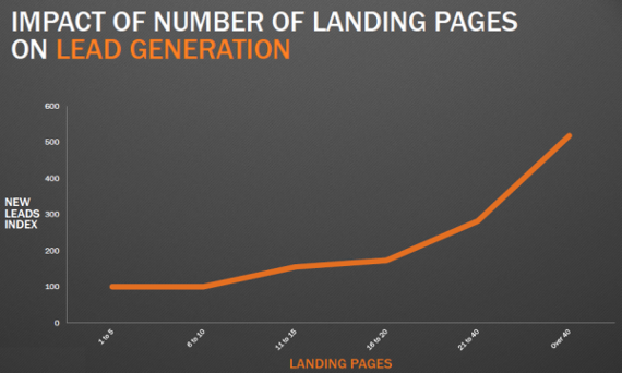
For paid search, we generally recommend creating a page for most individual queries, and there’s a distinct correlation between websites with multiple landing pages and the amount of leads that site generates (see below).

Source: HubSpot
If you then tie this into remarketing (the process of serving ads to users who have previously visited your site but not converted) then multi-page sites definitely hold the upper hand. This is because whilst it is not impossible to trigger remarketing pixels/scripts, it’s more complicated. It could also be more complicated if your CRM is connected to your website analytics and allows notifications to be sent to the sales team when a prospect hits a certain page.
For multi-page sites, this functionality is pretty much straight out of the box, where as for one page sites some form of custom setup would be required. This means that from a marketer’s perspective, multi-page websites hold a distinct advantage over their single page cousins.
So where does this all leave us?
Should I choose a one page or multi-page website?
Unfortunately, the answer is that it depends, and it relies on two main factors: content and marketing. If you have a small amount of products or services to offer, and are not too concerned with more advanced marketing tactics such as SEO, PPC and remarketing, a one page website is an option for you.
However, if you have more than ten products or services, or your content is quite intricate and complicated, then you can’t really provide a friendly user experience, or enough content depth, with a one page site. Equally, if marketing is important to you, then the options of the single page application are fairly limited in terms of promotion and thus a multi-page website is likely to be the most appropriate solution.
There is of course a third option — adopting a hybrid approach where, for example, your products and services are listed on your ‘homepage’, while using a blog or landing page tool to try and assist your marketing efforts. This won’t work for all organisations though, so it’s vital you seek specialist advice from relevant stakeholders.

