Get weekly
HubSpot updates
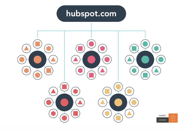
A pillar page, or ‘hub and spoke’ content, is a wonderful thing – and if you haven’t created one for your business yet, it’s about time you did.
We all want to be an authority in our industry. We want prospects, customers and competitors to view us as ‘thought leaders’ striding out in front with comprehensive knowledge, advice and data. One of the best ways you can do this is to create an extended piece of content, house it on a purpose-built webpage, and link all of your related blog posts to it: a pillar page. It’s simple really, but a task that can seem scary to begin with.
If you haven’t yet read our pillar page about pillar pages, this is a great place to start to help you understand everything you’ll need ahead of building your page. But if your content is written, approved, and ready to go, this post will walk you through how to format it in the most clear, appealing way, using tricks of the trade to optimise the page for conversions.
Before you start
Pick a topic that has infinite opportunities to create content about. If you choose a wide topic associated with your brand -- whether it's running shoes, crop planting, inbound marketing -- you'll have endless opportunities to create fresh content on the subject later. You need a cluster topic that you won't get sick of talking about, have original data on, and that shows off your business as a thought leader.
The example we will be using in this post is from our pillar page about pillar pages. If you’re uploading your content into HubSpot, this is a great article to help walk you through the steps. Below, we explore nine steps to implementing best practices in your first pillar page design:
Step 1: Use your usual branding, logo, colours and font
This is a different kind of page for most of your readers, so keep as much as possible familiar to them. To all intents and purposes, this needs to look like an extra-long blog post, so don’t use it as an opportunity to try anything new, in terms of presentation.
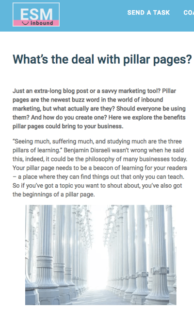
Position your logo in its usual place, use your familiar brand colours to pick out key elements and use the font style and size you would normally use on your blog: the function of this page may be different to usual, but the look and feel needs to be consistent with your existing content:

Step 2: Create a catchy headline
In only a few words, you need to explain exactly what question you’re going to answer in this content with your title. Ensure it uses a keyword so that search engines can find the page easily. When we wrote our pillar page about pillar pages, we did loads of research first to see how much this topic was coming up in searches.
Pillar pages were becoming a real “buzz word” in our industry with many businesses searching for the term online, so we knew we'd have greater success creating a long piece of content for this topic than other subjects we were considering.
Step 3: Write an introduction
Similar to how you would for a blog post, introduce your topic and the function of your page. Make it around 200 words and set it apart from the rest of the pillar page, right at the top. Explain what people will find in your post, highlight their pain points and introduce how you are going to help them (a related image always helps, too):
Step 4: Include a form
Pillar pages are an excellent opportunity to increase conversions. By including a lead-capture form at the top (and possibly again near the bottom of the page) you can encourage visitors to submit their email address and a few other details in exchange for a content offer – ensure this offer is associated with the page: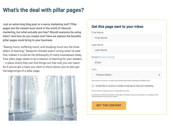
In this example, if you fill in our form, ESM Inbound will send you a PDF version of the pillar page to download and read at your leisure – many users actually prefer this to bookmarking and scrolling content as a webpage, even if this isn't its original purpose.
Don't make the form too long, you don't want people to be put off when they've only just arrived on your pillar page. But positioning it at the top of the page gives people the option to submit and download your content to come back to later, instead of feeling like they need to commit to reading it right away.
Step 5: Create anchored chapters
As a relatively short pillar page (about 3000 words), our example is split into six chapters – some of our other pages have many more. The possibilities are endless and as you build upon and add to your pillar page, you’ll add fresh chapters. This is the beauty of a pillar page – it’s never finished. As you develop your knowledge of a topic, you can teach your readers this new information and keep adding new chapters until it’s a priceless, comprehensive resource:
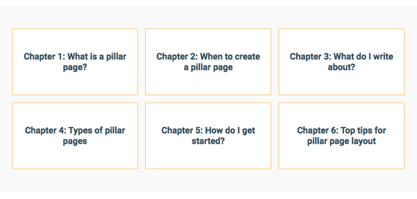
Including anchored chapters helps your reader skim the content, or cut straight to the topics that are of interest to them. Pillar pages need to be at least 3000 words long, and you can’t expect readers to digest every single word. Help them navigate your page, like a map would do – when they click on the chapter, it’ll take them straight to that section of content instead of endlessly scrolling.
Step 6: Include bulletpoints and whitespace
As with blog posts, you want your pillar page to be visually appealing – if anything, it’s even more important that you give your visitor plenty of space and easy-to-digest copy because of the sheer length of the content. Use bulletpoints wherever possible and divide paragraphs into short, clear sub sections so nothing looks too overwhelming.
Step 7: Use multimedia, where possible
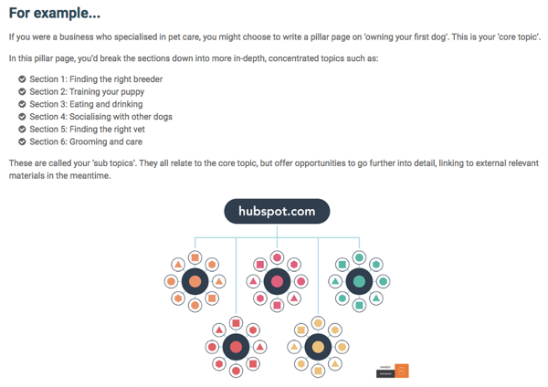
Video, sound clips, images and screenshots are all great ways to divide up your content, create natural breaks in the copy, and signal a new chapter or cluster topic is beginning. Using video should already be part of your content plan, so little helpful videos from you and your team explaining points in more detail means your visitor can relax and listen, instead of constantly reading – we process visuals 60,000 times faster than writing, so mix it up.
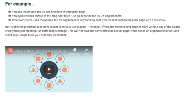
Even if the video content isn't your own, your point can still be enhanced by using a great video you've found elsewhere -- just be sure to reference the place you found it and link to it. On our pillar page, we used a fabulous animated video from HubSpot to enhance our point about how topic clusters work:
Step 8: Make your content interactive
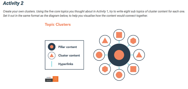
Even if you aren’t au fait with creating interactive tools, bots and other content just yet, giving your user activities to complete throughout your pillar page acts as a way to engage them and practise the skills you’re teaching them, step by step.
Whether they complete these straight away, or come back to them later, on paper or within a platform like HubSpot, it doesn’t matter – you’re helping visitors get more out of your content than if they were merely being passive, increasing engagement and brand trust.
Step 9: Include plenty of hyperlinked content
Yes, include external links to the sites you’ve found helpful yourself, but this is a real chance for you to link to your own content – in fact, it’s one of the key points of a pillar page. Every blog post you’ve created on this topic needs to point at this pillar page, and vice versa.
Create as many links as you can throughout your pillar page which are two-way; from the pillar page to blog posts, and back again. This is a tidy, ordered way to organise your content and signals to Google that your content is anchored in a user-friendly way, therefore bumping it up towards the top of search-engine results pages.
Embracing pillar page content should be part of your 2019 marketing strategy -- if it isn't yet, hopefully this post has shown how it's really just an extension of what you're already doing on your blog. Yes, it's a lot of content to produce in one go, and making it look just right does take time, but the way it houses all your content through links, creates order and organisation for search engines, and subsequently boosts your pages up the search engine rankings, surely makes it worth a try.
