
Get weekly
HubSpot updates
You only have one opportunity to make a good first impression with your website. It can be easy for your site to blend in and get lost. Clean and bold designs pull in more attention and help users to easily navigate your site.
It’s important to carry on the consistency throughout the whole site, as you never know where and what page a user might land on. You have to pay considerable attention to your homepage, but don’t forget to pay attention to other areas of your site.
Presenting the user with information in an organised, clean manner is one of the most popular design trends within web design at the moment. You don’t want to risk overwhelming your visitors, it’ll scare them off. We've all been on a site which was trying to do too much and it probably resulted in you bouncing off.
Clean design also helps the right elements stand out and minimises distractions. Having the right CTA placement, an attractive colour scheme, good usage of white space, strong typography, readability and a good information hierarchy are just some of the elements to consider.
Consider whether a one-page website is appropriate for what you're trying to achieve.
Here are 10 excellent examples of web design for your inspiration — enjoy!
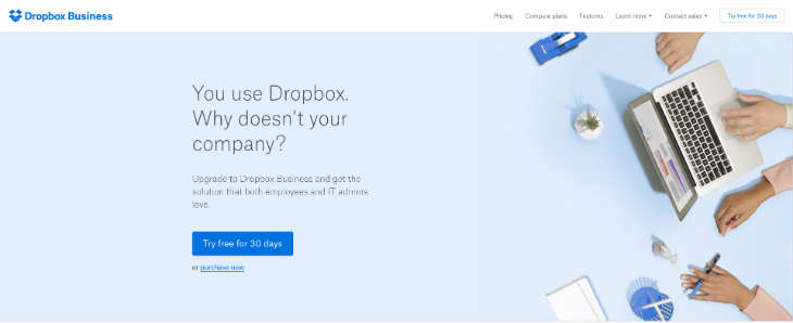
Dropbox Business
https://www.dropbox.com/business
Why we like it
- The Dropbox Business website is very simple but also very effective at the same time. It embraces the white space and uses it to its advantage.
- The colour scheme is also very easy on the eye. Once you see the blue buttons you automatically know it’s important. It uses light greys and light blues to compliment the overall colour palette.
- The typography is also easy to read and doesn't offend the user. Each line, heading and the body copy is perfectly adjusted for good readability
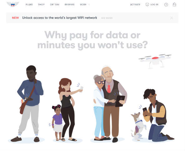
US Mobile
Why we like it
- The visual styling of the illustrations are very minimal but look great and work well to deliver the message.
- They use a very strong and wide range of colours and effectively combine them to make it work throughout the website.
- The readability is very strong. Clear font type and comfortable line spacing keep it simple and easy to read.
- The rounded CTA buttons work well as they give a softer look and feel throughout the site.
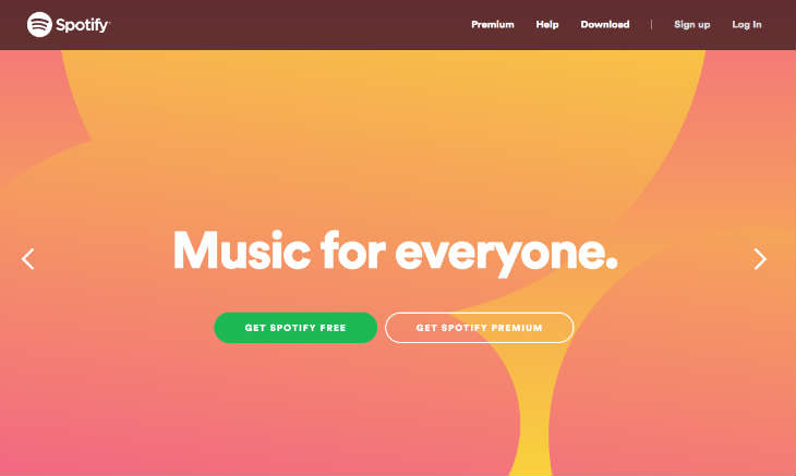
Spotify
Why we like it
- Spotify makes a very bold statement with their use of bright colour such as yellows, oranges and pinks, but they blend this in well with the use of white space, icons and CTAs.
- Each page has it’s own personality but is still consistent with the branding and the message.
Rightmove

Why we like it
- When searching for a place to rent or to buy, you want the end journey to be as easy as possible. Rightmove makes this task simple and directs the users to the right areas.
- The colour scheme and branding works nicely. The colours are easy to process and help to provide a clean looking website.
- There’s a lot of content to process and this is displayed in a good clean hierarchy. It doesn't bombard you with information but displays what you need to see.
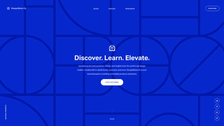
DesignBetter
Why we like it
- The use of scrollable elements works really well throughout the site.
- The loading icon is a smart and clever way to show the page load.
- The animated header image is a great way to capture attention and offers something different.
Lonely Planet
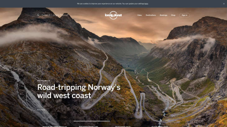
Why we like it
- It employs a great use of video and photography, particularly in capturing emotion that causes action.
- The intro sliders serve as an excellent visual intro onto the site.
- The layout of the site feels crisp, fresh and open.
- A prominent search function makes sure you find what you're looking for with relative ease.
Paris Saint-Germain FC
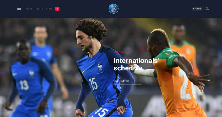
Why we like it
- The use of grids throughout the site aligns the information in an easy form to digest.
- The use of colour to divide up each section helps define what content belongs to what section.
- The sticky menu navigation bar works in a smart way. It appears when you scroll up the page, which is small but effective function.
- Good use of imagery throughout the site.
GlobeKit
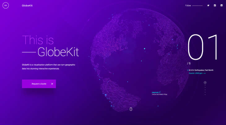
Why we like it
- Great use of animation which adds an interactive factor to the site.
- The simple six-step scroll function delivers the message and the information in a nice presentable format.
Jetty
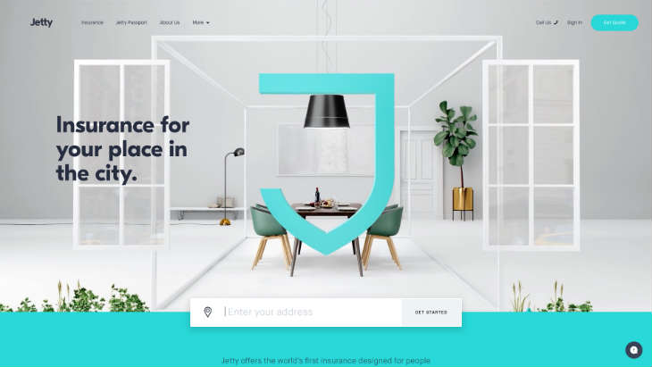
Why we like it
- Great use of animation and interactive elements across the whole site.
- Very clean and fresh feel. Utilises the white space well and adds in subtle hints of light greys to contrasting dark colours amongst different sections.
- The visual hierarchy on each page is consistent and increases the readability of the overall site.
Essential
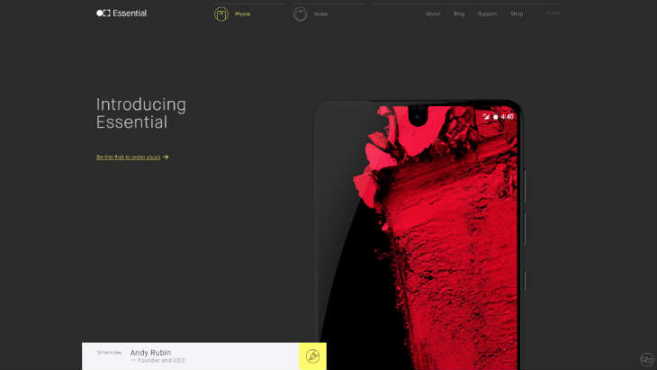
Why we like it
- The asphalt grey has a really nice contrast with the white text and the yellow text links. Highlighting the important facts.
- Animation once again plays an important role on this site. From the phone appearing on the screen to information boxes scrolling through. It leaves you wanting to see more. The key is they haven't overdone it and it feels like the right blend.
What do you think of these inspirational examples? Have they inspired you to maybe try something different? Share your thoughts with us in the comments below.
