L&DI
Learning & Development Institute
Membership Website
Case study
Industry: Professional Training and Coaching
HubSpot products used:
Marketing Hub Professional
Service Hub Professional
CMS Hub Enterprise
Website: www.landdi.ie
Results overview:
- 1. A reduced bounce rate of direct traffic from 60.75 to 51.41% = 9.34 % in the first three months after launch
- 2. Increased Individual Membership sign up by 33.33%
- 3. Different price points for members and non-members on events and courses using HubSpot custom objects.
Services used:
- Diagnostic Engagement
- UX Research
- UX Design and Prototyping
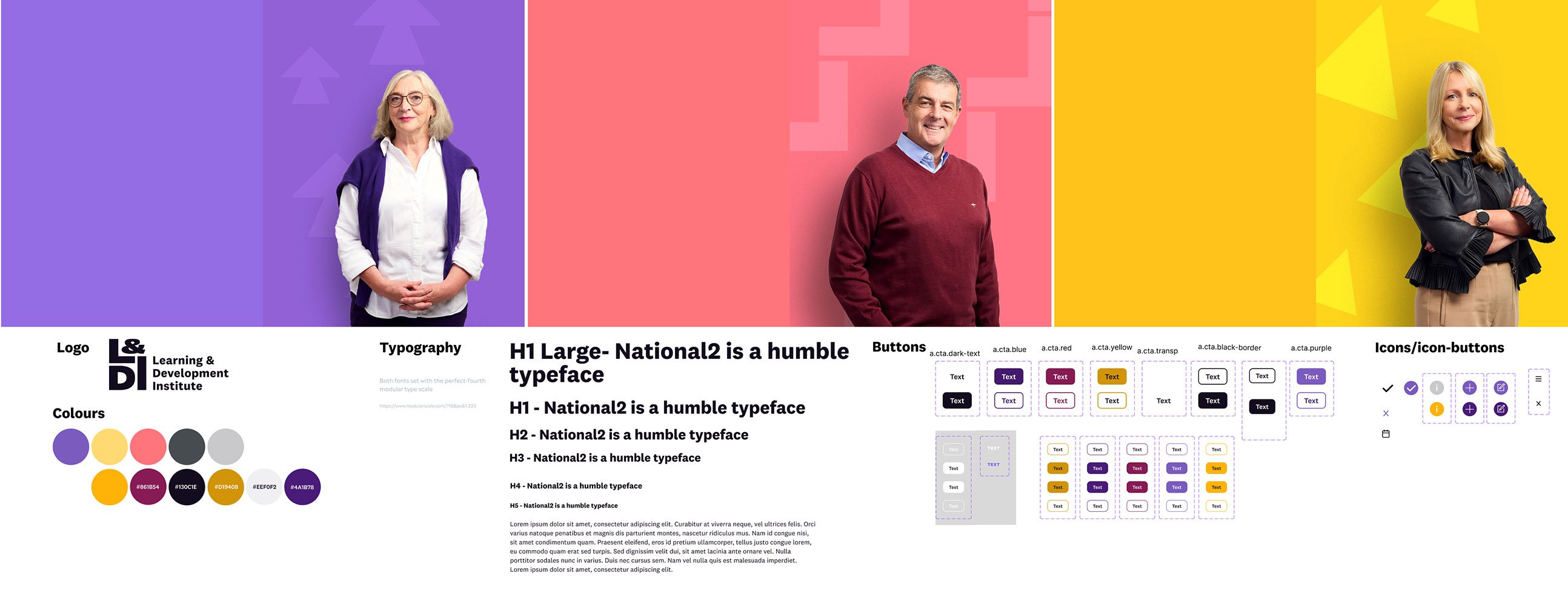
- UI (User Interface) design system & full set of high-fidelity designs using the branding and design steer provided by the branding company CI Agency
- Service Blueprint Design
- Data Import
- CRM Automation (HubSpot workflows & emails)
- Backend Integration with Payment Systems: Sage & Stripe
- Serverless Function Development
Summary
The Irish Institute of Training and Development (IITD) rebranded to the Learning and Development Institute, or L&DI, to stay relevant and better serve its members. Designing and building a new membership website was critical to the rebrand project. The website needed to:
- Feature new branding
- Work on a user-friendly CMS, allowing L&DI to update most website pages easily
- Have membership functionality with gated pages
- Automate billing invoicing and online payments
- Enable events and training course bookings with customised pricing, depending on the user’s membership levels
- Capture/segment data from website forms into HubSpot.
The challenge
The client had a tech stack with multiple suppliers, which was hard to manage; they wanted to combine everything into HubSpot. The website was outdated, hard to use and incredibly difficult to update.
Members had very little autonomy to amend and complete their profile and account section, and weren’t interacting with the website much, if at all. Because the website content was hard to update, the business used several disparate WordPress websites to house content that should have been part of the original website.
There was no purchasing facility for event tickets or courses on the website.
Users could sign up to become a member and pay online, although the membership sign-up process was a whopping nine steps long!
Users & audience
During our scoping phase, the client provided us with the following data regarding user demographics:
- Female 60%
- Male 40%
- 35-45 age range
- L&D professionals or aspiring professionals in Ireland, entry-level up to director level.
Our design process
UX Research
We used quantitative and qualitative data to understand the current system better. The research methods were usability tests, interviews, and customer satisfaction surveys. Affinity diagrams helped us synthesise a large amount of data, and once we had the data grouped and named, we could distil the information into a customer journey map.
.png?width=1278&height=684&name=CjourneyMap%20(1).png)
Notable findings
Overall
Users felt overwhelmed by the homepage and the navigation; it was cluttered, and the naming and grouping of navigational items could have been more straightforward.
Membership sign-up
Users were frustrated by the number of steps needed to complete the process (nine in total). They were also taken aback at the fact that they needed to upload their qualifications to achieve membership.
In addition, they weren’t sure what the various membership levels meant or if there was a different price point. There was also mass confusion about the pay-by-invoice choice at the end of the process.
.png)
Book a course
The old website directed users to various external websites, PDFs and links when viewing and booking courses. Consequently, they found it difficult to understand the information as the format in which the data was presented lacked consistency.
One user quipped, “I’m bamboozled!” when trying to book a course.
Book an event
Users found the calendar format utterly confusing and didn’t understand why some events in the future had 'book' buttons and some did not.
Corporate memberships
Corporate member enrolment was a very manual process - this caused enormous administrative work and was prone to error. In addition, the website had no facility for corporate members to enrol, and the account section had no corporate member management or view whereby the corporate admin could view and manage the members on their account.
Impact of research on the product:
Overall
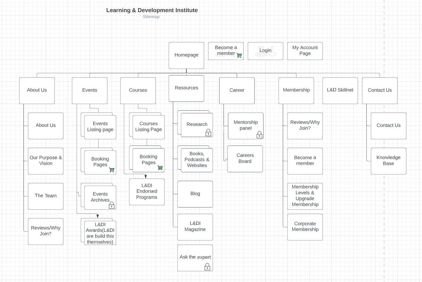
We simplified the navigation and sitemap to only the necessary items and ensured the grouping and categorisation made sense.
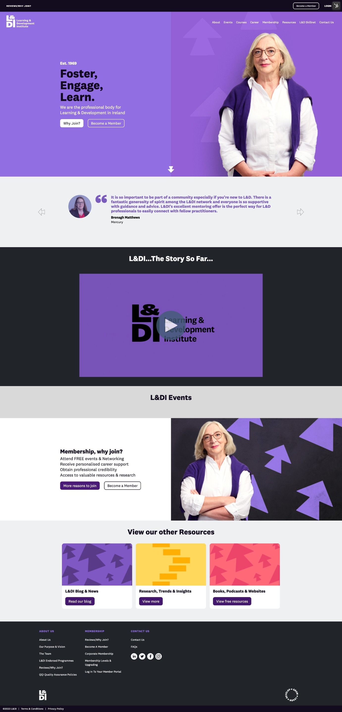
We also edited the homepage to ensure the user sees the highlights, rather than everything at first glance.
Membership sign-up
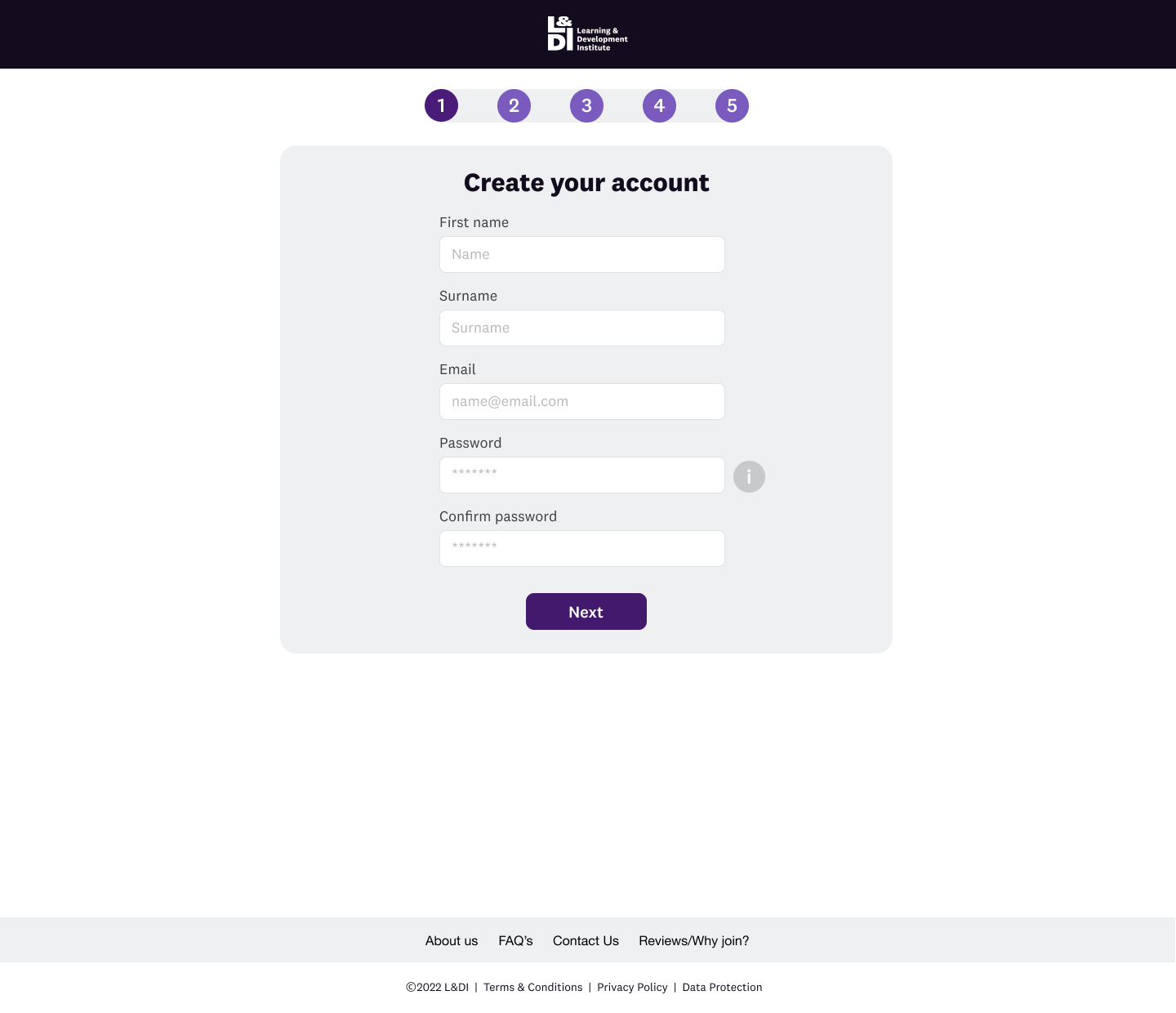
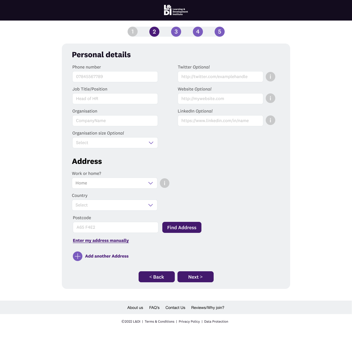
In order to simplify the membership sign-up process, we:
- Removed all superfluous elements on the membership sign-up page so the user could focus on the task at hand
- Reduced the steps from nine to five by chunking relevant information together. We implemented a postcode look-up field to enable users to add their addresses quickly
- Ensured that users could skip adding qualifications and experience, but understood that it meant joining as an affiliate member. We added a tick box with a pop-up window, informing them what the various levels were
- Added tooltips to help guide users and inform them why we were asking specific questions
- Removed pay-by-invoice choice as this didn’t make sense for the individual membership use case.
Book a course or event
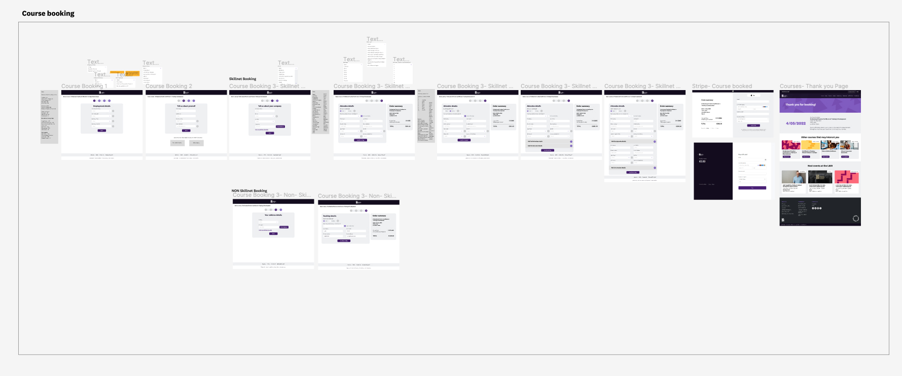
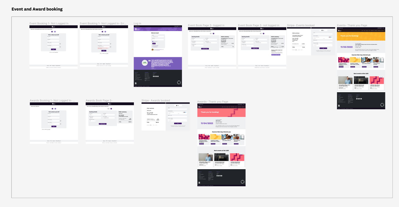
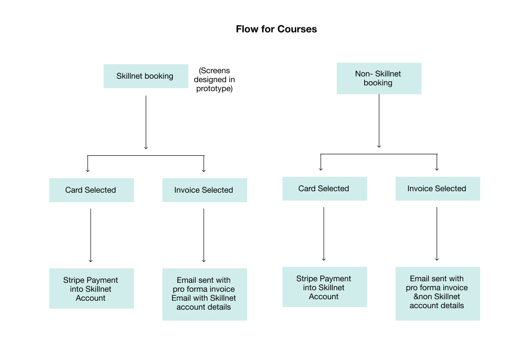
- We used progressive disclosure on the booking forms to ensure we broke the questions into manageable chunks.
- On the course booking, where some questions could feel quite personal, we added an info tooltip to explain why we were asking the question and that they were going through a qualification process to receive a discounted course via the Skillnet grant.
- We added a tick-box where the user could say if they were an attendee so that they didn’t have to fill all their details out again, as they would have given the information in the earlier steps.
- We removed the calendar view and replaced it with two simple tabs, “past” and “upcoming”.
Corporate memberships
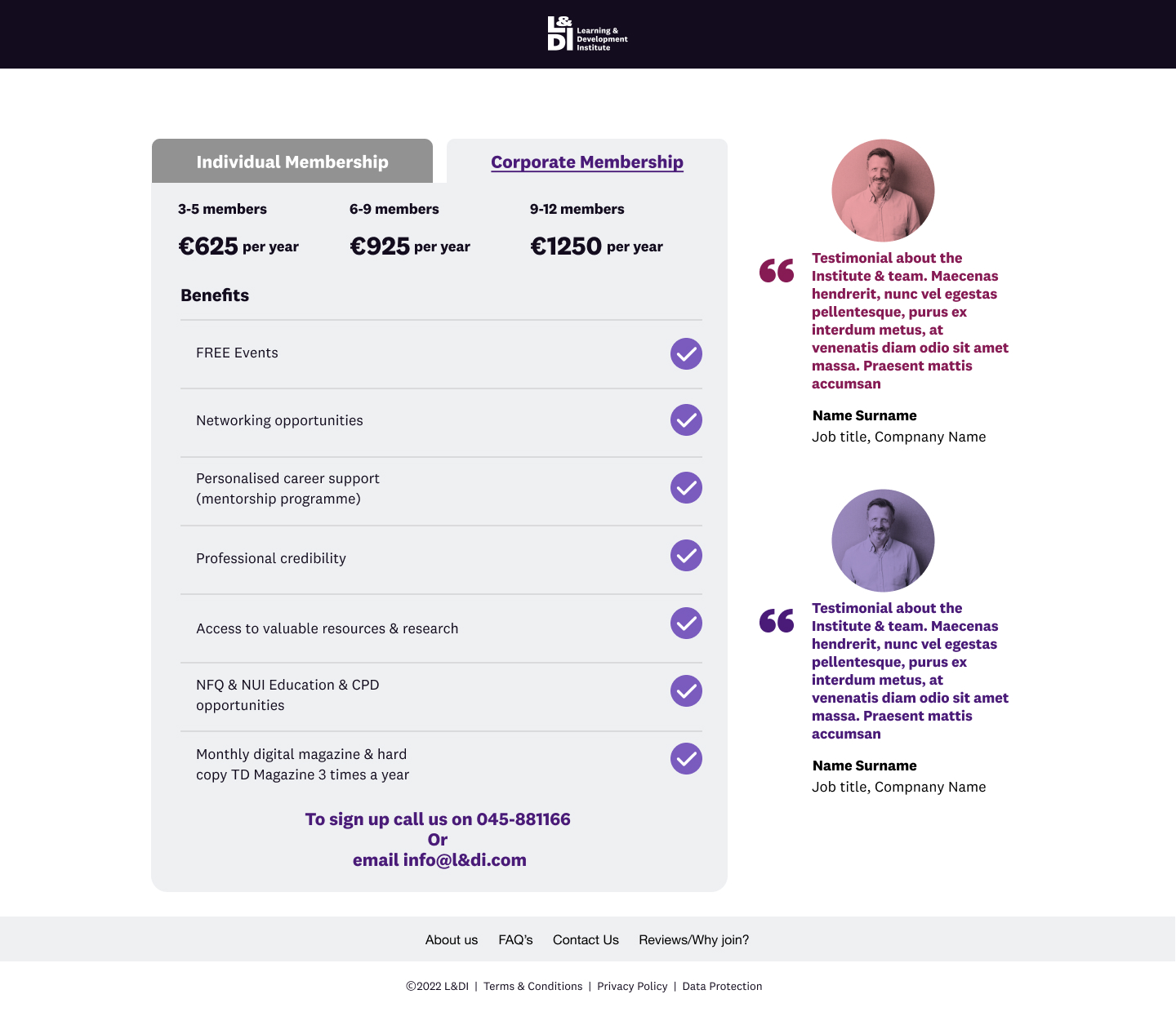
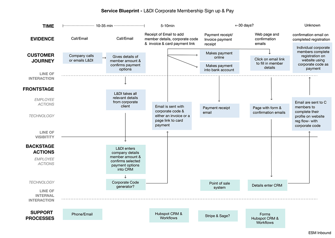
- We created a Service Blueprint which helped us plan and visualise the relationships between different service components — people, props (physical or digital evidence), and processes — that are directly tied to touch-points in the corporate customer journey.
- We designed a corporate admin section with two unique views:
- Admin users can see the members in the package and edit as needed.
- The corporate member user can’t see other members and can only see their own details.
- We designed a bespoke corporate sign-up flow that enables corporate members to sign up via the website.

Our CRM process
Diagnostic Engagement (investigation)
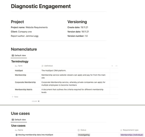
We conducted a Diagnostic Engagement report to understand the root cause of some of L&DI's pain points, and better understand members' needs.
The diagnostic included an in-depth session with key L&DI stakeholders for 30 days, which helped us generate specific use cases and acceptance criteria for the new membership processes and automation.
Solutions built from Diagnostic Engagement
To improve the membership sign-up process, we:
-
Created an automated process to allocate membership tier, status and sign-up date, and trigger welcome emails and membership registration
-
Created an automated tier-review process whereby a task is allocated to L&DI when a member is eligible for a tier upgrade, and confirms this via email to the member
-
Automatically set a membership lapsed stat to trigger lapsed membership warning emails, and reduce membership churn.
Book a course or event
- We utilised HubSpot's HubDB table function to generate dynamic event and course pages
-
We used a custom object to collect data on each event or course booked to allow greater segmentation of L&DI's data.
Corporate memberships
-
We created a sign-up process to identify the admin contact on a corporate membership
-
Now other corporate members can complete their profiles individually using workflow actions and automated emails
-
We automated the 'Corporate code' allocated to members as a unique identifier for the corporate membership
-
We created the ability to change and update members associated with the corporate membership via the membership portal.
Results:
- A reduced bounce rate of direct traffic from 60.75 to 51.41% = 9.34 % in the first three months after launch.
- Increased Individual Membership sign up by 33.33%
- Membership website and a merged tech stack with all purchases and bookings done on one website, via Stripe and Sage integrations
- A robust HubSpot theme and dynamic (HubDB-powered) pages enable the business to update events, courses and resources quickly and easily
- An automated booking process that enables users to book courses at a discounted rate if they qualify for a Skillnet grant
- Different price points for members and non-members on events and courses using HubSpot custom objects.
Request a quote
If you're looking for a highly technical HubSpot Solutions Partner, then SpotDev (part of the Everybody Smile More Group) is the ideal choice. Fill in the form below to get a quote from our team:
Please note that we will need to book a call to discuss your project in order to provide a committed quote.
Get a quote
Our clients love our work
"ESM Inbound is fantastic! I'm very happy to recommend ESM Inbound for web and email (and everything else HubSpot related)."
"Proactive, practical, pragmatic, professional, praiseworthy - as a HubSpot partner, I couldn't have asked for more!"
"Deliverables and timelines are always mapped out very clearly in consultation with us, making it easy to find the right options to fit our projects and budgets."